
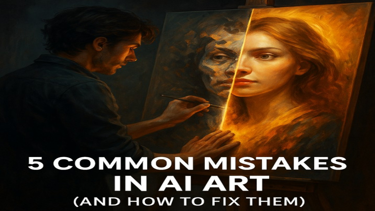
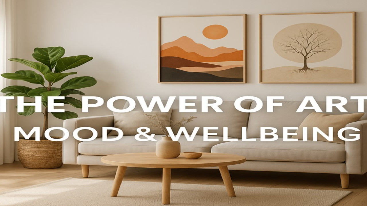
Color Psychology in Art – How Shades Influence Emotion
Every color tells a story. Whether it’s the warmth of red, the calm of blue, or the optimism of yellow, color psychology plays a crucial role in how we perceive and feel art.
🎨 The Language of Color
Colors are more than visual elements — they’re emotional triggers. Artists use color to influence mood, communicate ideas, and build atmosphere.
For example:
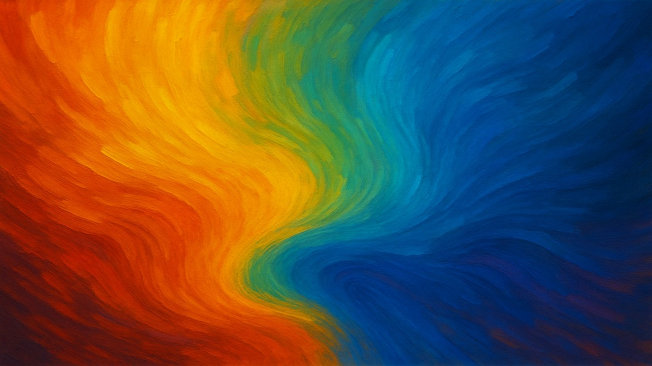
Red evokes energy, love, and passion.
Blue conveys calmness, peace, and reflection.
Yellow radiates joy, light, and positivity.
Black and white explore contrast, mystery, and simplicity.
At Styon Art, every color is chosen intentionally — to make you feel, not just to make you see.
🌈 The Emotional Spectrum
Artists understand that color harmony creates emotional resonance. Complementary hues can add tension, while soft gradients create serenity.
Even digital artists use AI color grading and emotional mapping to fine-tune the feelings their art evokes.
🧠 The Science Behind It
Studies show that color affects heart rate, perception, and memory. In design and painting, this science becomes art — shaping how people respond to visual experience.
✨ Final Thought
Color is emotion made visible. At Styon Art, each shade is a heartbeat in the larger story of creation — a dialogue between the artist’s soul and the viewer’s heart.


Comments (0)
No comments found