
How to Choose the Perfect Wall Art Colors for Your Home in 2025
How to Choose the Perfect Wall Art Colors for Your Home in 2025
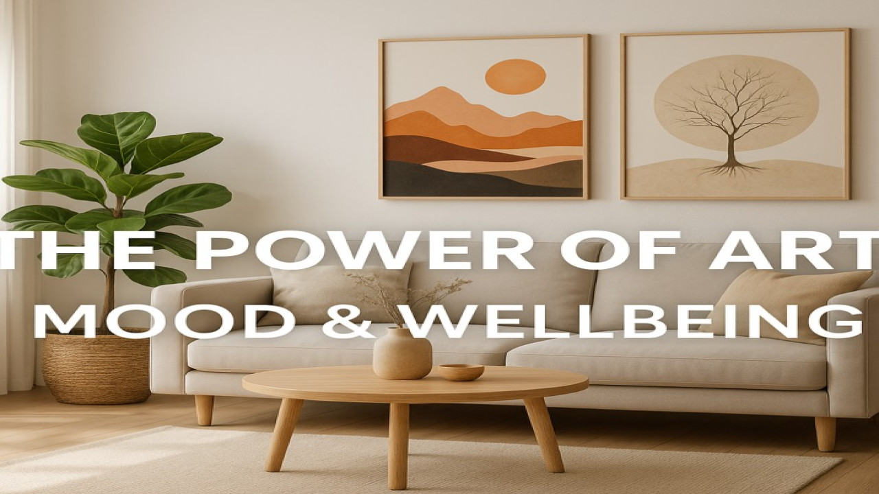
Choosing the right colors for your wall art is one of the most important steps in creating a beautiful and harmonious home. In 2025, color psychology and interior design trends focus on balance, emotional well-being, and visual impact. The right artwork can transform any room — making it feel calm, vibrant, luxurious, or cozy.
Here’s the complete guide to choosing the best wall art colors for your home, curated by Styon Art (https://styonart.com).
1. Choose Colors That Match Your Room’s Mood
Different colors create different emotional effects.
Warm colors (terracotta, gold, beige, caramel)
→ Comfort, coziness, warmth
Cool colors (blue, teal, green)
→ Calm, freshness, relaxation
Neutral colors (white, grey, taupe, sand)
→ Minimalism, balance, elegance
Bold colors (red, black, orange)
→ Energy, power, intensity
Your wall art should reflect the emotional atmosphere you want to create.
2. Match Wall Art Colors With Your Interior Palette
Use the 70-20-10 rule:
70% dominant room colors (walls, furniture)
20% secondary colors (pillows, rugs)
10% accent colors (wall art!)
Wall art is the easiest way to introduce new accents.
3. Use Contrasting Colors for High Impact
Contrast makes artwork stand out.
Examples:
beige room → black & white art
grey room → gold accent pieces
white room → warm earthy tones
Contrast = modern, stylish, premium.
4. Choose Warm Colors for Cozy Spaces
Warm tones are trending in 2025 because they create a calm, inviting energy.
Perfect for:
bedrooms
living rooms
reading corners
These tones pair beautifully with canvas prints.
5. Choose Cool Colors for Workspaces and Modern Interiors
Blue, teal, and emerald green support:
focus
clarity
productivity
Modern offices and home workspaces benefit greatly from cool-toned artwork.
6. Black & Gold = Luxury and Elegance
One of the biggest trends of 2025 is black and gold artwork — especially on metal prints.
It brings:
sophistication
luxury vibes
a rich visual aesthetic
Ideal for premium living rooms and offices.
7. Choose Soft Neutrals for Minimalist Homes
Minimalist interiors need artwork that matches the clean, calm aesthetic.
Choose:
beige
cream
light grey
sand
brown accents
These tones blend seamlessly with Scandinavian and Japandi interiors.
8. Consider Lighting Before Choosing Colors
Lighting changes how colors look.
Warm light
→ enhances gold, beige, brown
Cool light
→ enhances blue, grey, black
Natural light
→ works well with all-neutral artwork
If your room is dark, avoid extremely dark artwork.
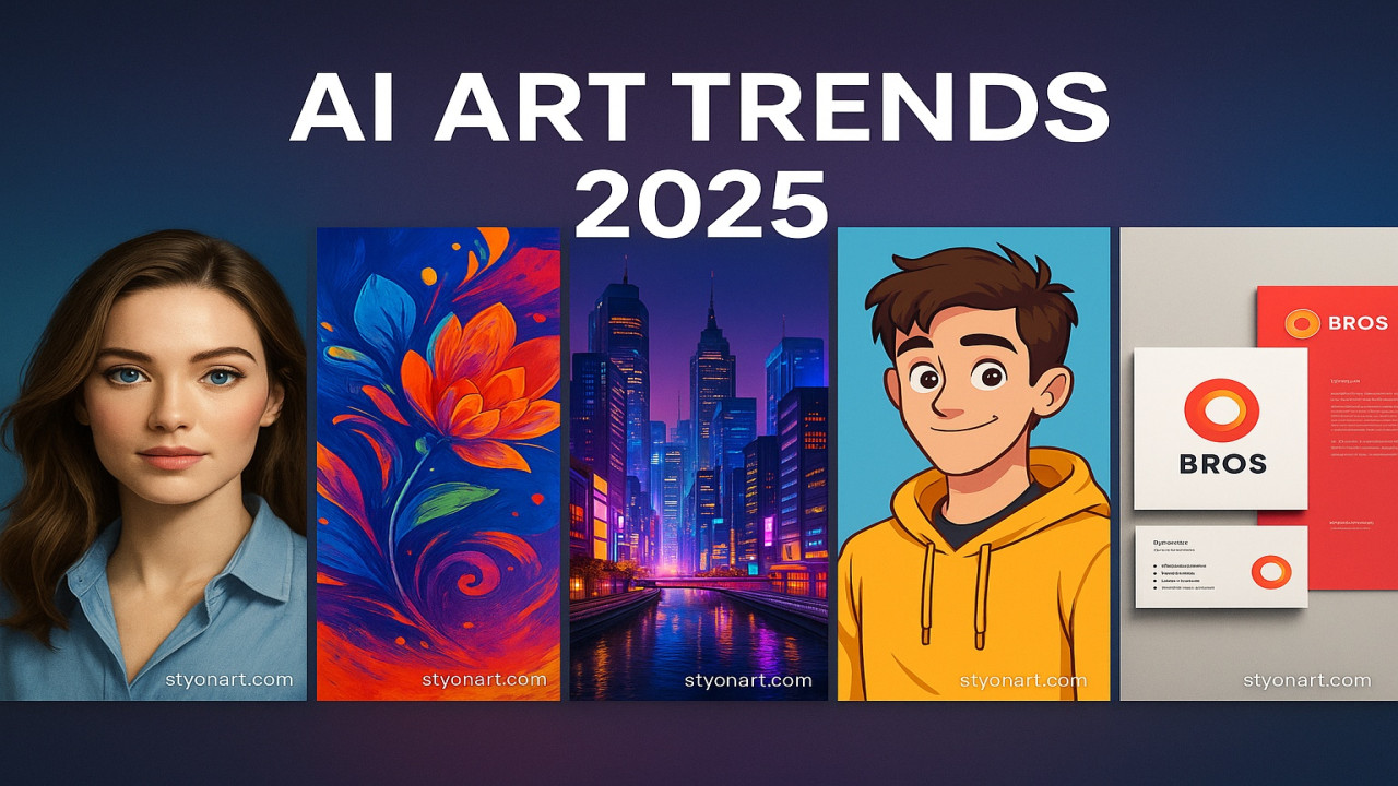
9. Use AI Art for Perfect Custom Color Matching
AI-generated art allows you to choose:
exact shades
gradients
color combinations
brightness
This ensures the artwork fits your room perfectly.
10. Choose Colors That Reflect Your Personality
Your home should feel like you.
Choose artwork that makes you feel:
calm
inspired
energized
nostalgic
motivated
Color should elevate your emotions, not just your decor.
Conclusion
Choosing the perfect wall art colors in 2025 is about emotion, harmony, and intentional design. Whether your home is minimalist, modern, luxurious, or eclectic, the right colors will transform your environment.
Explore premium canvas and metal art designed in beautiful, modern palettes at Styon Art (https://styonart.com).


Comments (0)
No comments found