
How to Choose Wall Art Colors That Match Your Home Décor (2025 Guide)
How to Choose Wall Art Colors That Match Your Home Décor (2025 Guide)
The colors in your wall art can completely transform your home. Whether you want a calm atmosphere, a bold statement, or luxury accents, choosing the right color palette is essential. In 2025, interior design focuses on harmony, contrast, and emotional impact — and wall art plays a major role in shaping the mood of each room.
This guide from Styon Art (https://styonart.com) teaches you how to choose wall art colors that perfectly match your décor.
1. Start With Your Existing Color Palette
Before choosing art, identify your home’s dominant colors.
Look at:
✔ sofa
✔ rugs
✔ curtains
✔ furniture
✔ accent pieces
✔ wall color
Your wall art should complement or enhance these tones, not compete with them.
2. Use the 60–30–10 Color Rule
This classic interior design rule works perfectly in 2025.
60% — dominant room color
30% — secondary color
10% — accent color
Your wall art should fall into the 30% or 10% zone to blend beautifully.
3. Match Tones, Not Exact Colors
You don’t need identical color matches — tone harmony matters more.
Examples:
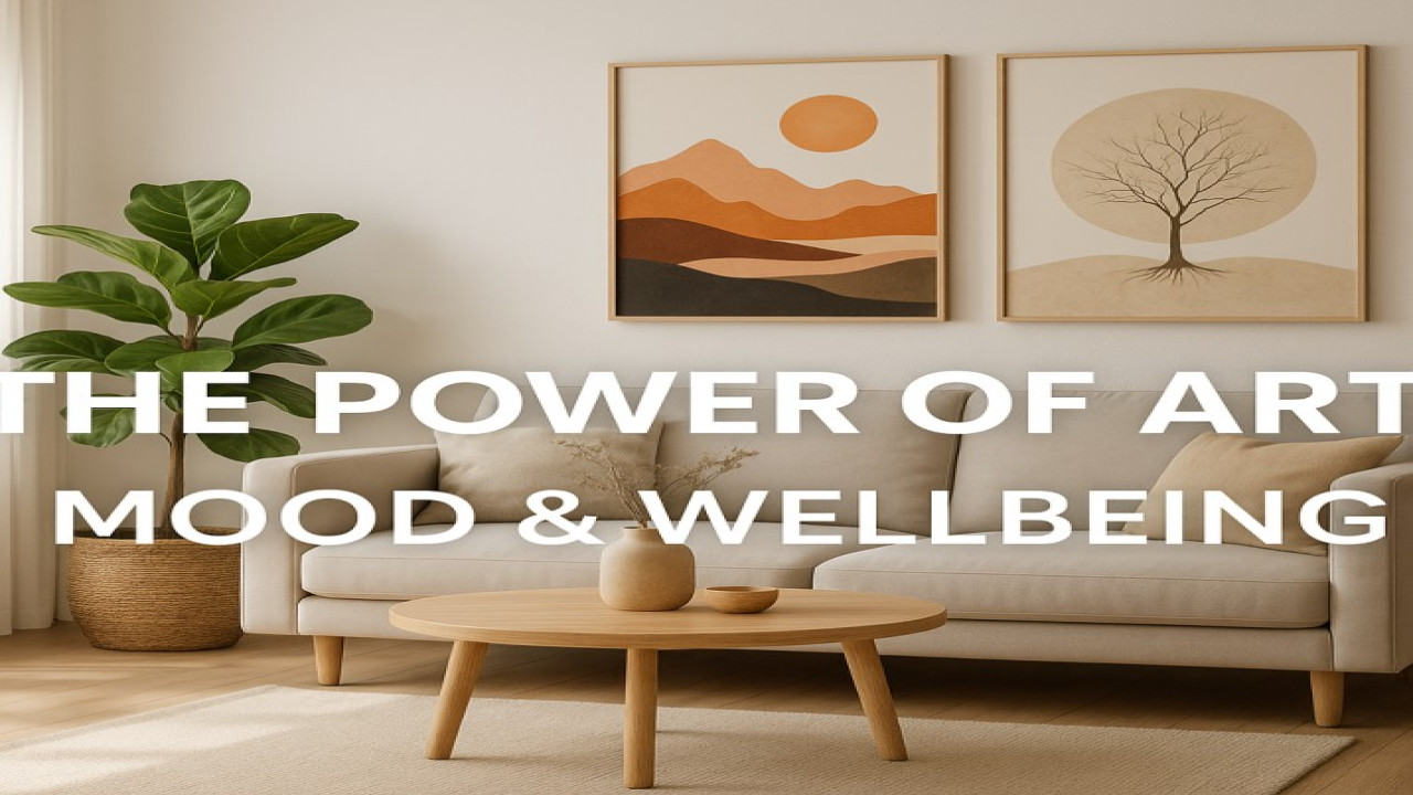
A beige sofa → warm earthy-toned artwork
Grey furniture → cool-toned abstract blues
Wood furniture → natural greens and browns
Matching tones creates a natural visual flow.
4. Choose Colors Based on Mood
Every color influences the atmosphere of a room.
Calm & Relaxing:
✔ blue
✔ sage green
✔ soft grey
✔ beige
Energizing & Creative:
✔ orange
✔ yellow
✔ bright blue
✔ red accents
Elegant & Luxurious:
✔ black
✔ gold
✔ emerald
✔ deep navy
Choose the emotional effect you want.
5. Use Contrast for Modern Homes
Contrast adds depth and visual interest.
Examples:
✔ white walls → black & gold art
✔ dark walls → bright minimalist art
✔ neutral rooms → bold abstracts
Contrast makes artwork stand out while still fitting the décor.
6. Keep Color Temperature Consistent
Warm décor works best with warm art.
Cool décor works best with cool art.
Warm colors:
✔ beige
✔ terracotta
✔ gold
✔ brown
Cool colors:
✔ blue
✔ teal
✔ grey
✔ green
Mixing temperatures can work — but only with balance and intention.
7. Choose Neutral Art for Maximum Flexibility
Neutral-toned artwork is timeless and works in almost any room.
Best neutral colors:
✔ cream
✔ taupe
✔ black & white
✔ soft grey
✔ natural beige
Neutrals are ideal for minimalist and Scandinavian homes.
8. Match Artwork Color to Furniture Accents
This strategy creates instant visual harmony.
Examples:
✔ black metal table legs → black line art
✔ gold décor pieces → gold-accent artwork
✔ wooden furniture → earth-tone nature art
Repeating small accents across your space elevates the entire room.
9. For Bold Interiors, Use Art as the Statement Color
If your home is mostly neutral, let your wall art bring the color.
Best bold colors for 2025:
✔ emerald green
✔ mustard yellow
✔ deep navy
✔ burgundy
✔ terracotta
A single large bold piece can transform the entire room.
10. Test Artwork With Mockups Before Buying
Always visualize the artwork in your space.
Best method:
Use Styon Art product previews and mockups to ensure the colors match your walls and décor.
Mockups eliminate 90% of color-matching mistakes.
⭐ BONUS: Quick Color Guide (2025)
| Room | Best Color Themes | Emotional Effect |
|---|---|---|
| Living Room | warm neutrals + gold | cozy, inviting |
| Bedroom | blue, sage, beige | calm, restful |
| Office | grey, navy, green | focused, professional |
| Kitchen | white, light grey, pastels | fresh, clean |
| Hallway | black & white | modern, structured |
| Dining Room | warm earth tones | intimate, elegant |
Conclusion
Choosing wall art colors that match your home décor is one of the most effective ways to create harmony, beauty, and mood in every room. Whether you prefer bold statements or soft minimalism, the right palette transforms your home instantly.
Discover color-coordinated art collections at Styon Art:
👉 https://styonart.com


Comments (0)
No comments found