
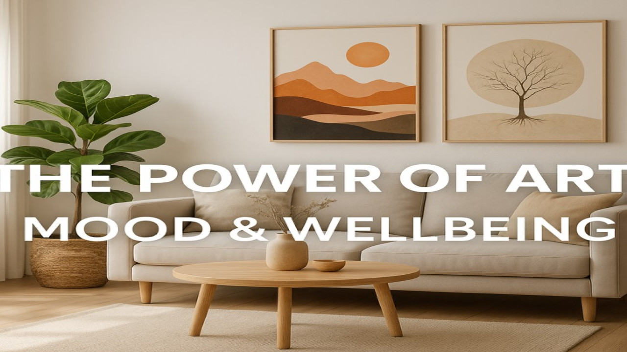
🎨 The Language of Color — How Art Colors Influence Mood and Emotion
🌈 Every Color Speaks
Before words, there was color.
It’s the oldest language of emotion — one that bypasses logic and speaks directly to your heart.
From the warm glow of gold to the deep calm of blue, every hue carries meaning.
And when you choose art, you’re not just choosing what you see — you’re choosing what you feel.
At StyonArt, we believe color is the heartbeat of every creation.
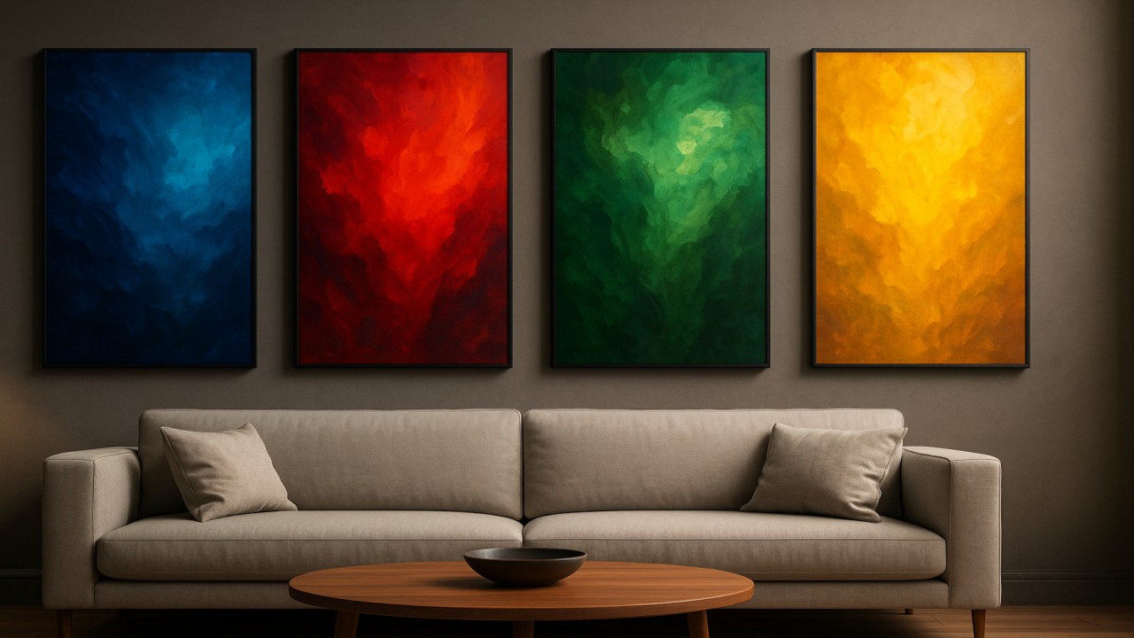
💙 Blue — Calm, Clarity, and Trust
Blue is the color of serenity — of open skies and endless oceans.
It brings a sense of order, peace, and reflection.
Use blue wall art in spaces where you seek calm and clarity — bedrooms, offices, or relaxation corners.
It reminds your mind to slow down, breathe, and trust the process.
🖼️ Blue whispers peace.
❤️ Red — Passion, Energy, and Power
Red is emotion in motion.
It excites, ignites, and commands attention.
In interior art, red tones work beautifully in creative or social areas — studios, dining spaces, or modern living rooms.
It’s the color of movement, desire, and fearless expression.
🔥 Red doesn’t wait to be noticed — it is the moment.
💛 Yellow — Joy, Optimism, and Light
Yellow radiates positivity.
It’s the visual equivalent of sunshine, instantly brightening any space.
A yellow accent artwork brings cheer and vitality, especially to neutral rooms.
It fuels creativity and makes every morning feel full of potential.
☀️ Yellow is happiness made visible.
💚 Green — Balance, Renewal, and Growth
Green symbolizes balance between heart and nature.
It’s the color of new beginnings and emotional recovery.
Green tones in wall art help you ground your energy — ideal for bedrooms, wellness spaces, or home offices.
It connects luxury with life.
🌿 Green breathes harmony into every wall.
🖤 Black, White & Gold — The Language of Elegance
Monochrome tones express sophistication.
Black and white artworks bring focus, clarity, and timeless beauty.
Gold accents add warmth, luxury, and spiritual depth — transforming a simple wall into a statement.
They’re perfect for minimalist or modern interiors that value balance over excess.
✨ Luxury is born from simplicity — elevated by light.
🌤️ Combining Colors for Emotional Harmony
When you mix colors intentionally, you create emotional balance:
Blue + White → calm and purity
Green + Gold → natural luxury
Red + Black → passion and power
Yellow + Grey → optimism with sophistication
Every StyonArt piece is designed with emotional color balance — to create harmony, not chaos.
🎨 It’s not about colors competing — it’s about emotions collaborating.
💫 The StyonArt Color Philosophy
Color is not random — it’s a design language that shapes human experience.
At StyonArt, we treat color like a story:
Hue speaks emotion.
Contrast adds character.
Light gives life.
Our mission is to transform blank walls into emotional experiences — to turn color into connection.
✨ Final Reflection
Colors are not just seen — they’re felt.
Every hue carries a vibration that changes how you move, think, and feel inside your home.
So when you choose art, don’t just ask, “Does it match my room?”
Ask, “Does it match my mood?”
👉 Discover the StyonArt Collection — where every color speaks your language.

Comments (0)
No comments found