
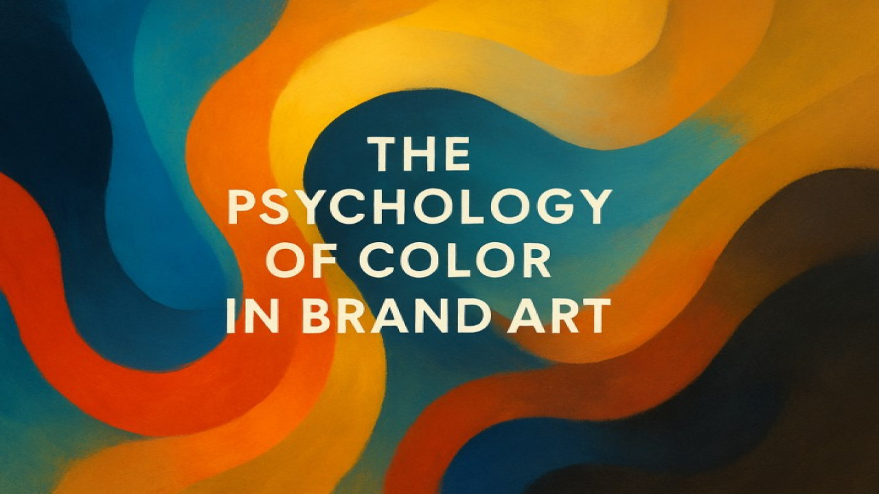
The Psychology of Color in Brand Art
Colors are more than aesthetic choices — they’re emotional triggers. In branding, color is psychology in motion, shaping perception, memory, and behavior. Through artistic design, brands can influence how people feel about them long before they speak a word.
🎨 The Emotional Language of Color
Each hue carries meaning:
Blue inspires trust and calm.
Red evokes passion and urgency.
Black communicates sophistication and power.
Gold represents luxury and achievement.
At Styon Art, we use color intentionally — blending psychology with artistic harmony to create brands that resonate emotionally.
🧩 Art as Emotional Engineering
A brand’s artwork sets its emotional tone. Whether minimalist or expressive, every color combination tells a story.
The key isn’t just to stand out — it’s to feel right.
💡 The Science Behind It
Color impacts how customers behave:
85% of buyers say color is the main reason they choose a product.
Consistent color usage increases brand recognition by up to 80%.
This is why art and psychology go hand in hand in professional branding.
✨ Final Thought
Art is emotion made visible — and color is its heartbeat.
At Styon Art, we turn color into strategy, crafting visuals that don’t just attract — they connect.

Comments (0)
No comments found