
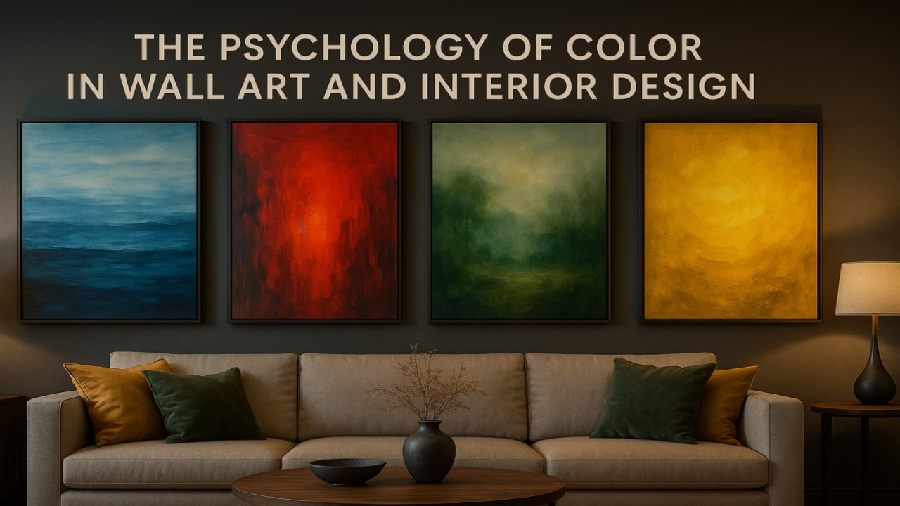
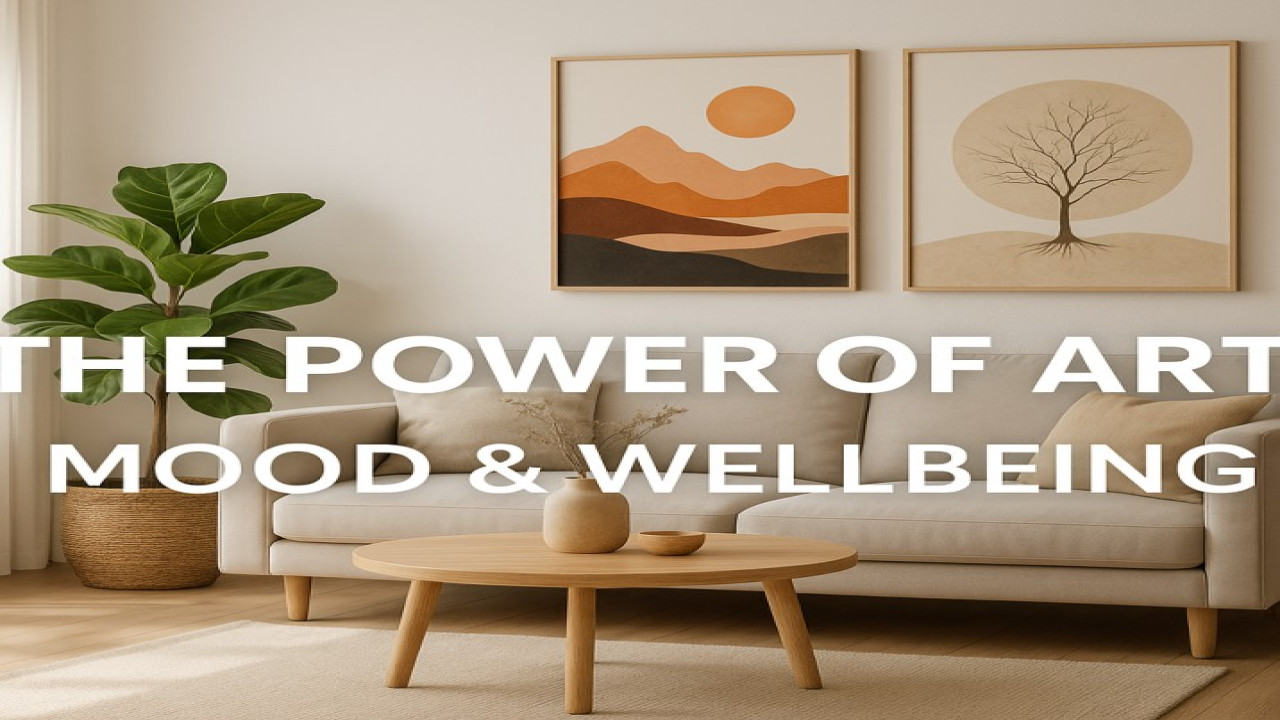
🎨 The Psychology of Color in Wall Art and Interior Design
Color is more than a visual element — it’s a language of emotion.
In art and interior design, color influences how we feel, think, and behave.
A single painting can make a room feel warmer, more spacious, or more energetic — simply through its palette.
At StyonArt, we believe that every hue carries meaning. Understanding color psychology helps you choose the artwork that not only fits your space but also shapes your mood every day.
🔵 Blue — Calm, Clarity, and Trust
Blue is one of the most universally loved colors. It brings a sense of peace, serenity, and openness — like a quiet ocean or a clear sky.
Best for: bedrooms, offices, and reading areas
Effect: reduces stress, enhances focus, and promotes calm thinking
Art suggestion: abstract ocean views or minimalist modern blue-themed pieces on matte canvas
🔴 Red — Passion, Power, and Confidence
Red is energy. It grabs attention and evokes strong emotion. Used in the right balance, it creates warmth and dynamism.
Best for: living rooms, restaurants, creative studios
Effect: stimulates conversation, excitement, and vitality
Art suggestion: bold geometric or pop-art designs on brushed aluminum for maximum contrast and shine
🟢 Green — Balance, Renewal, and Harmony
Green connects us to nature — it represents growth, balance, and calm. It’s the perfect color for relaxation and rejuvenation.
Best for: living rooms, kitchens, or workspaces
Effect: reduces anxiety, brings freshness, and increases productivity
Art suggestion: botanical art or natural landscapes on canvas for organic texture and warmth
🟡 Yellow — Happiness, Creativity, and Energy
Yellow is the color of sunlight and optimism. It stimulates the mind and sparks inspiration, especially in creative environments.
Best for: studios, hallways, children’s rooms
Effect: encourages joy, energy, and positive emotion
Art suggestion: abstract or modern pieces with golden tones on Alu Dibond Seidenmatt for elegant brilliance
⚫ Black & White — Sophistication and Balance
Monochrome art never goes out of style. It creates contrast, structure, and elegance — especially in minimalist or luxury spaces.
Best for: modern living rooms, offices, and high-end interiors
Effect: balance, confidence, and timeless appeal
Art suggestion: conceptual or architectural designs on Brushed Alu for a refined gallery look
💫 Combining Colors for Perfect Harmony
The magic happens when colors interact.
A mix of blue and gold can create a luxurious calm.
Green and beige bring nature indoors.
Black, white, and red — the timeless trio — add energy and balance.
When selecting wall art, consider both your emotional goal and your room’s color palette.
Your choice should amplify the atmosphere you want — not fight against it.
🖼️ The StyonArt Approach: Emotion in Every Color
Each piece in the StyonArt collection is created with intention — combining color, texture, and form to evoke emotion and harmony.
Whether you want to feel inspired, grounded, or energized, there’s an artwork that speaks your language — the language of color.
👉 Explore the StyonArt color collections and discover how each shade can transform your home into a masterpiece of emotion and design.

Comments (0)
No comments found