
The Psychology of Colors in Wall Art – How Art Shapes Your Mood and Energy 🌈🧠
🧠 Introduction
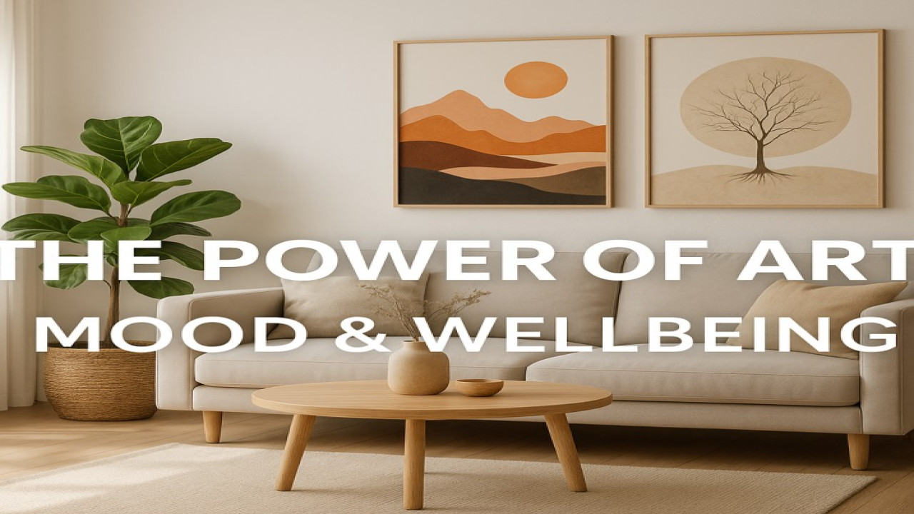
Art does more than decorate your walls — it shapes your emotions.
Every color, shape, and texture communicates energy that affects how you feel in your space.
At Styon Art, we explore the deep connection between color psychology and modern living.
Let’s discover how to turn your home into a source of harmony and inspiration.
🌈 The Language of Colors
Each color has a psychological impact — subtle yet powerful.
🔵 Blue: calm, clarity, and focus. Ideal for offices or bedrooms.
🟢 Green: balance, peace, and renewal. Perfect for living spaces.
🔴 Red: passion, warmth, and intensity. Use it for creativity or motivation.
🟡 Yellow: joy, optimism, and mental energy. A great fit for kitchens and studios.
⚫ Black & Gold: luxury, depth, and confidence. Perfect for modern, elegant interiors.
🤍 White & Beige: purity, minimalism, and light. Expands space visually.
✅ Pro Tip: Styon Art’s collections are categorized by emotion and style, making it easy to find pieces that align with your mood or desired atmosphere.
🎨 How Art Affects Your Energy
Every artwork creates a frequency in your environment — an emotional rhythm.
Abstract art encourages freedom and creativity.
Nature-inspired designs foster relaxation and mindfulness.
Pop art energizes your space with bold confidence.
Minimalist art helps you declutter your thoughts.
By choosing the right combination, you can design your home to support your goals — focus, relaxation, or inspiration.
🪶 Emotional Design in Modern Homes
The best interiors aren’t just beautiful — they’re alive.
More people are now decorating based on how they want to feel, not just what looks trendy.
That’s why personalized art is booming — because it connects emotion with environment.
With Styon Art, you can choose your colors, materials, and designs to reflect your emotional identity.
💡 Practical Tips for Choosing the Right Colors
🎯 Match warm colors (red, orange) with modern metallic finishes for bold looks.
🌿 Use cool tones (green, blue) on canvas for a calming natural feel.
🖤 Combine black and gold metal prints for luxury interiors.
🤍 Add white or beige posters for balance and simplicity.
Mixing tones and textures helps you achieve both emotional comfort and visual depth.
✨ Conclusion
Colors aren’t just visuals — they’re vibrations.
They change how you think, feel, and live.
By choosing art intentionally, you’re not just designing your walls —
you’re designing your energy.
🎨 Styon Art: Feel every color, live every emotion.

Comments (0)
No comments found