
The Psychology of Colors in Wall Art: How to Choose the Right Colors for Your Home in 2025
The Psychology of Colors in Wall Art: How to Choose the Right Colors for Your Home in 2025
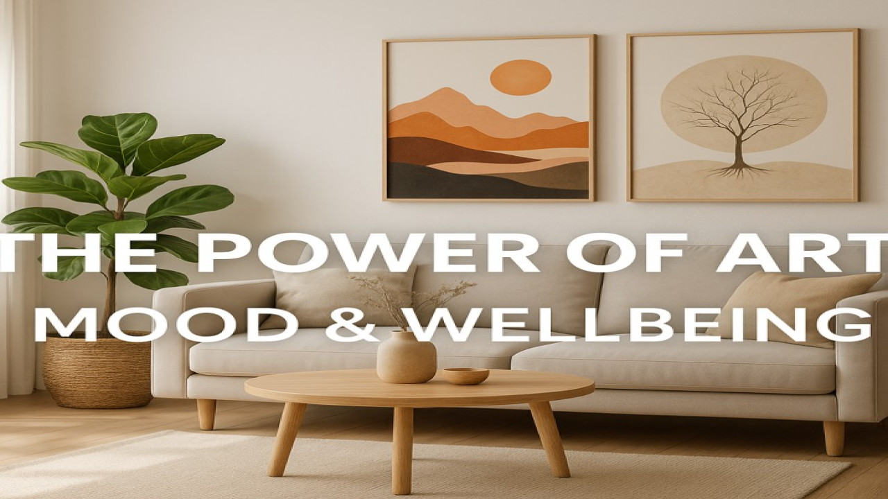
Colors have a powerful impact on how we feel in our homes. In 2025, interior design blends warm minimalism with expressive, emotional decor — and wall art plays the biggest role in shaping a room’s atmosphere. Understanding color psychology helps you choose artwork that not only matches your interior style but also supports your mood and daily well-being.
At Styon Art (https://styonart.com), every artwork is crafted with emotion and atmosphere in mind.
1. Warm Earth Tones — Comfort, Calm, and Coziness
Warm tones continue dominating interior design in 2025:
Terracotta
Ochre
Rust
Clay
Caramel
Soft beige
Why they work:
These shades create warmth, safety, and a homey feeling — ideal for living rooms, bedrooms, and cozy spaces.
Best for:
Minimalist art, abstract compositions, nature-inspired prints.
2. Greens — Balance, Freshness, and Nature
Green is one of the most psychologically calming colors.
Why it works:
Green restores balance, reduces stress, and connects the room to nature.
Shades trending in 2025:
Sage green
Moss
Deep forest
Olive
Best for:
Nature prints, forest photography, botanical line art.
3. Blues — Serenity, Focus, and Relaxation
Blue is the color of clarity and calm. It’s scientifically proven to reduce heart rate and soothe the mind.
Trending blues:
Midnight blue
Navy
Soft pastel blue
Frosty blue
Best for:
Bedrooms, workspaces, meditation areas, coastal-style decor.
4. Neutrals — Elegance, Balance, and Minimalism
Neutrals remain the backbone of 2025 interior decor.
Cream
Sand
Taupe
White
Gray
Why they work:
They pair with everything and create a timeless, upscale look — especially when used in abstract or line art.
5. Black — Power, Sophistication, and Contrast
Black adds depth, elegance, and a luxurious touch.
Why it works:
It creates visual contrast and elevates any artwork to a gallery-like feel.
Best for:
Line art, minimalist shapes, premium metal prints.
6. Bold Colors — Expression, Creativity, and Personality
If you want your home to feel energetic, bold colors are perfect:
Mustard yellow
Emerald green
Crimson red
Electric blue
Orange accents
Why they work:
They stimulate creativity, boost energy, and immediately draw attention.
Best for:
AI-generated art, pop art, portraits, modern abstract prints.
7. How to Choose the Right Color for Your Space
Here’s a simple guide to picking colors that match your home:
✔ Match the room’s purpose:
Bedroom → soft neutrals, blues
Living room → warm earthy shades
Office → green, blue, minimal tones
Hallway → contrast colors (black, gold, bold palettes)
✔ Complement your furniture:
Choose colors that blend or contrast intelligently with your walls, sofa, curtains, and carpets.
✔ Consider lighting:
Warm lighting → earth tones look best
Cool lighting → blues and metal prints shine
✔ Follow your emotional preference:
Your home should match how you want to feel.
Conclusion
Understanding color psychology allows you to choose wall art that not only looks beautiful but also enhances your well-being. In 2025, colors are more important than ever — they define mood, energy, and identity.
Explore modern, color-balanced artwork at Styon Art (https://styonart.com) and choose pieces that make your home feel truly yours.

Comments (0)
No comments found